. If we work together you will get three entirely different design options to choose from,
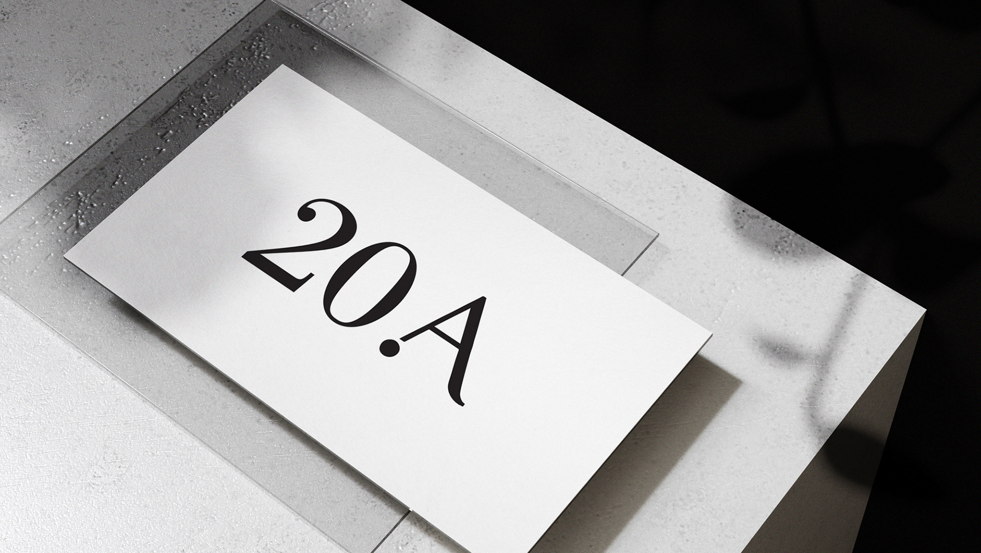
here is an example of PAL's.
here is an example of PAL's.
PAL wants to disrupt the accounting & financial services space. Most accounting firms can be seen as stuffy, corporate, boring and overwhelming. PAL Accounting is different. Their motto is 'Your Friend in Business" They are open, approachable, friendly and supportive.
They wanted a logo that was clean, professional and fresh, but can also appeal to a slightly younger audience (25-40 year olds) as well as their dads. They are based in Geelong, Victoria
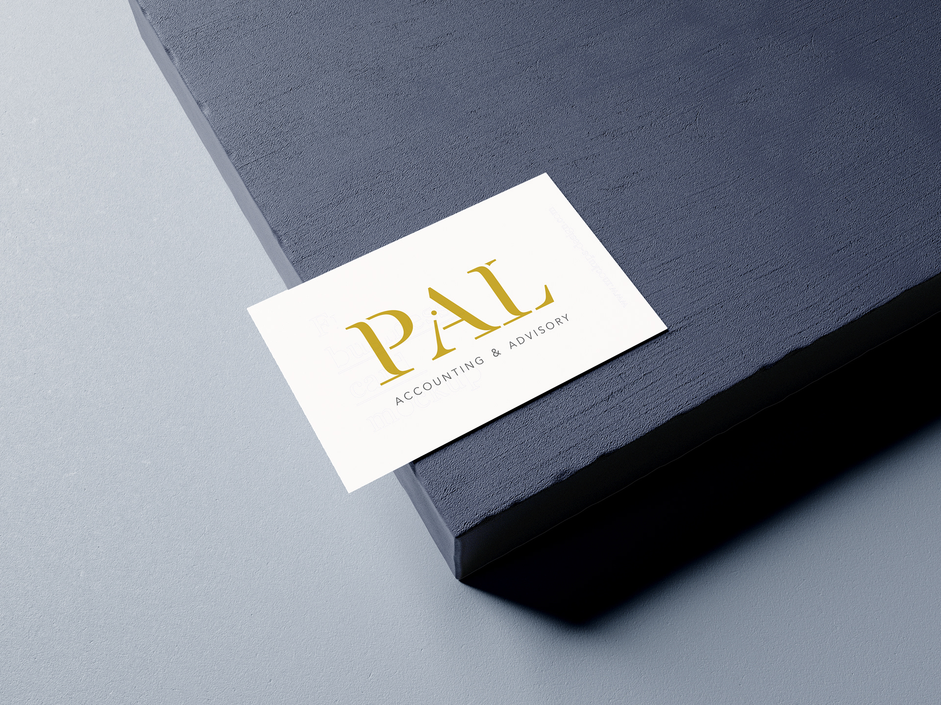
Option 1. The use of a Serif font, which can often be classed as quite corporate and conservative, but we have some curves and lines cut into the type to create something far more interesting, modern & fresh; The soft curvy lines gives it a sense of friendliness and approachability, and the use of a serif still implies a professional accounting firm, but with a younger fresher twist.
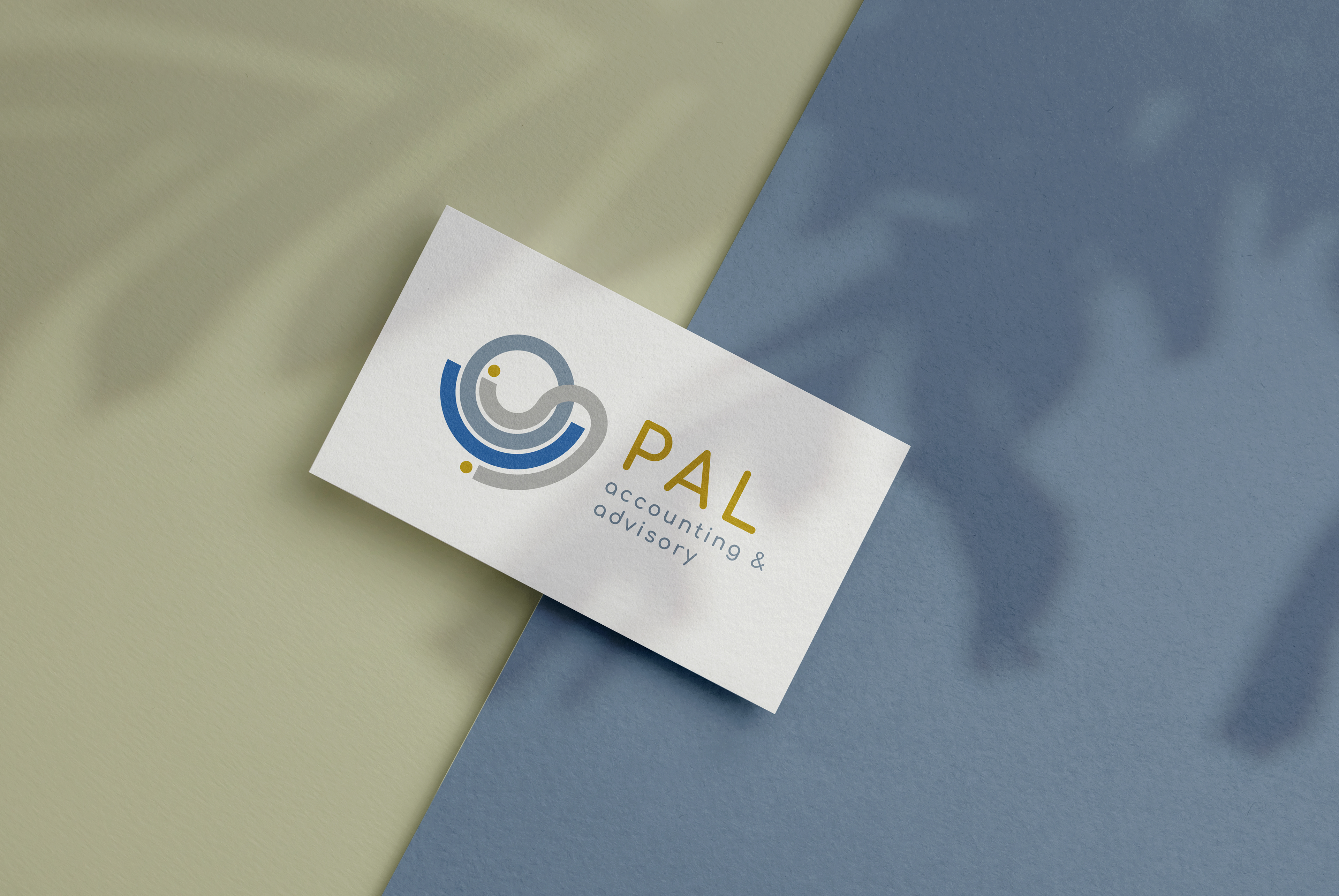
Option 2. Fluid and circular lines supporting each other, representing a helping hand for customers on their financial journey. The wave and overlap in the lines works well visually, but is also an ode to the ocean that Geelong is so close to, and it's customers hold close to their hearts.

Option 3. A subtle and minimal ode to a smile to show the companies approachability, friendliness and
non-stuffiness. Really delivering their slogan of 'your friend in business'.
non-stuffiness. Really delivering their slogan of 'your friend in business'.